enabling predictable revenue
Sole Product Designer | Research, UX & UI | 2025-2026Transitioning from a static account page to a scalable, state-based dashboard system.
TL;DR
the problem.
Our account page was a cluttered mix of cards with no hierarchy. We needed one unified dashboard that would satisfy different user types.
the solution.
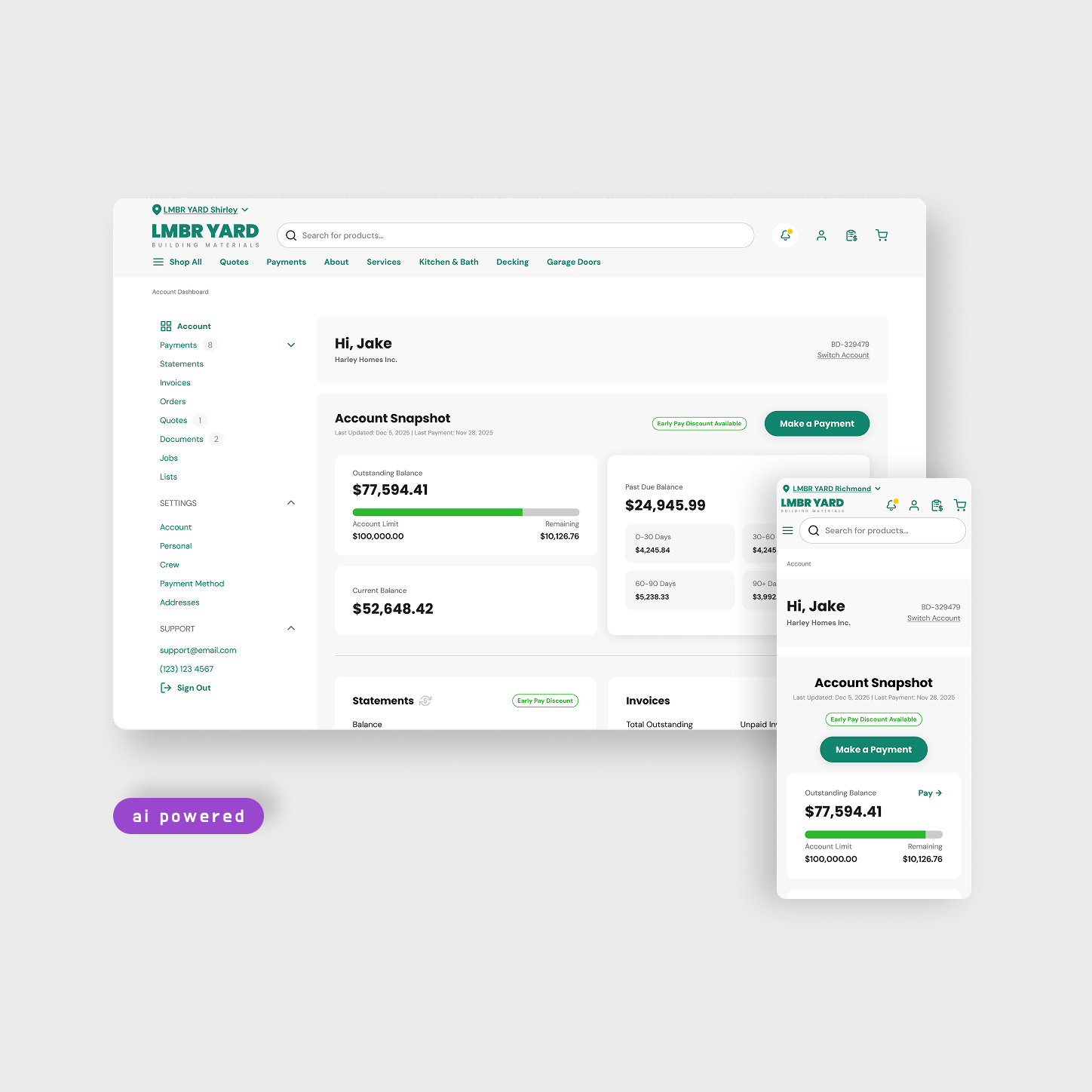
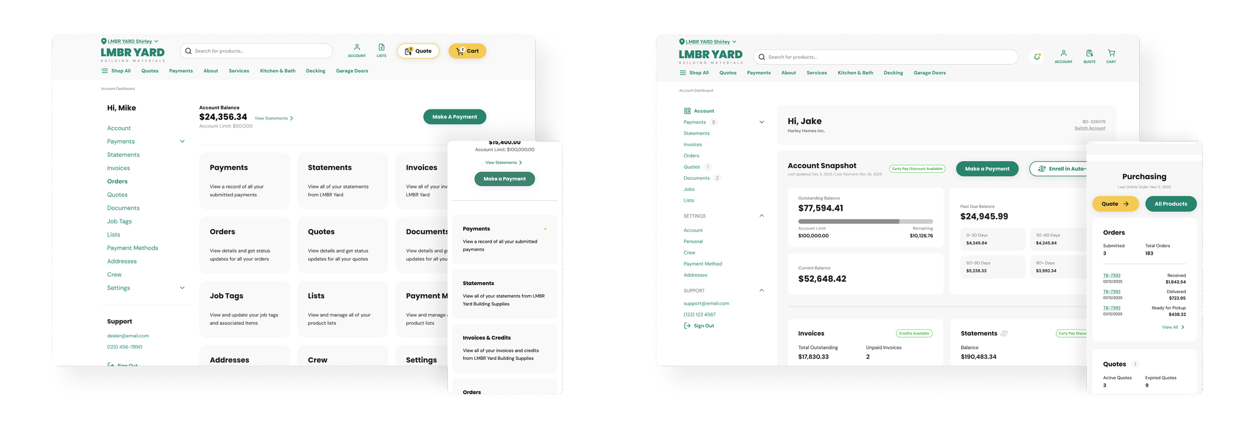
I designed a component-driven dashboard where sections appear or disappear based on user type, permissions & activity. This logic-based layout kept the codebase clean while feeling personalized to each user.
the outcome.
By introducing a role-based dashboard architecture, we reduced duplicated designs, accelerated delivery, and improved payment transparency — driving more reliable customer payments and stronger seller cash flow.
scroll down for the detailed study ↓
the problem.
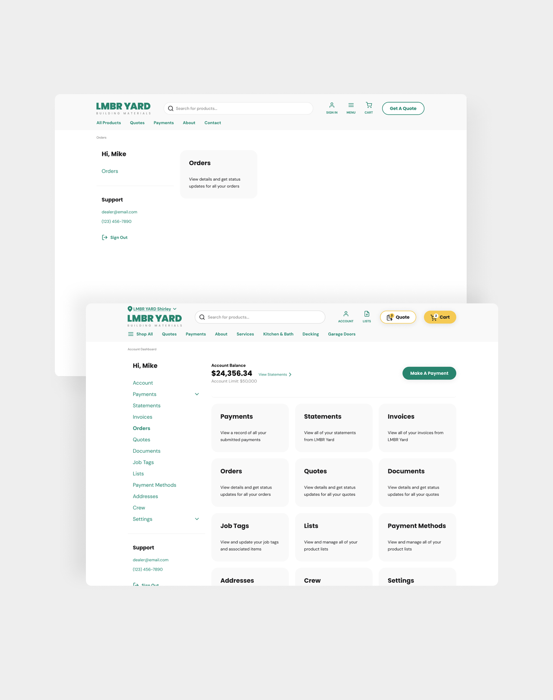
Our original account page was a "collection" of cards that kept adding up as the company grew. It lacked a clear hierarchy, from basic profile settings to complex features. This created a cluttered view that didn't serve any visual purpose. We needed a single dashboard that could serve different user types without creating separate and hard-to-maintain experiences.
the strategy & research.
One part of the research was collecting information from the internal teams who were communicating with sellers on daily basis. I learnt that the customers wanted to quickly see theirs orders & quotes, their balances and have a quick pay flow when they are on the go.
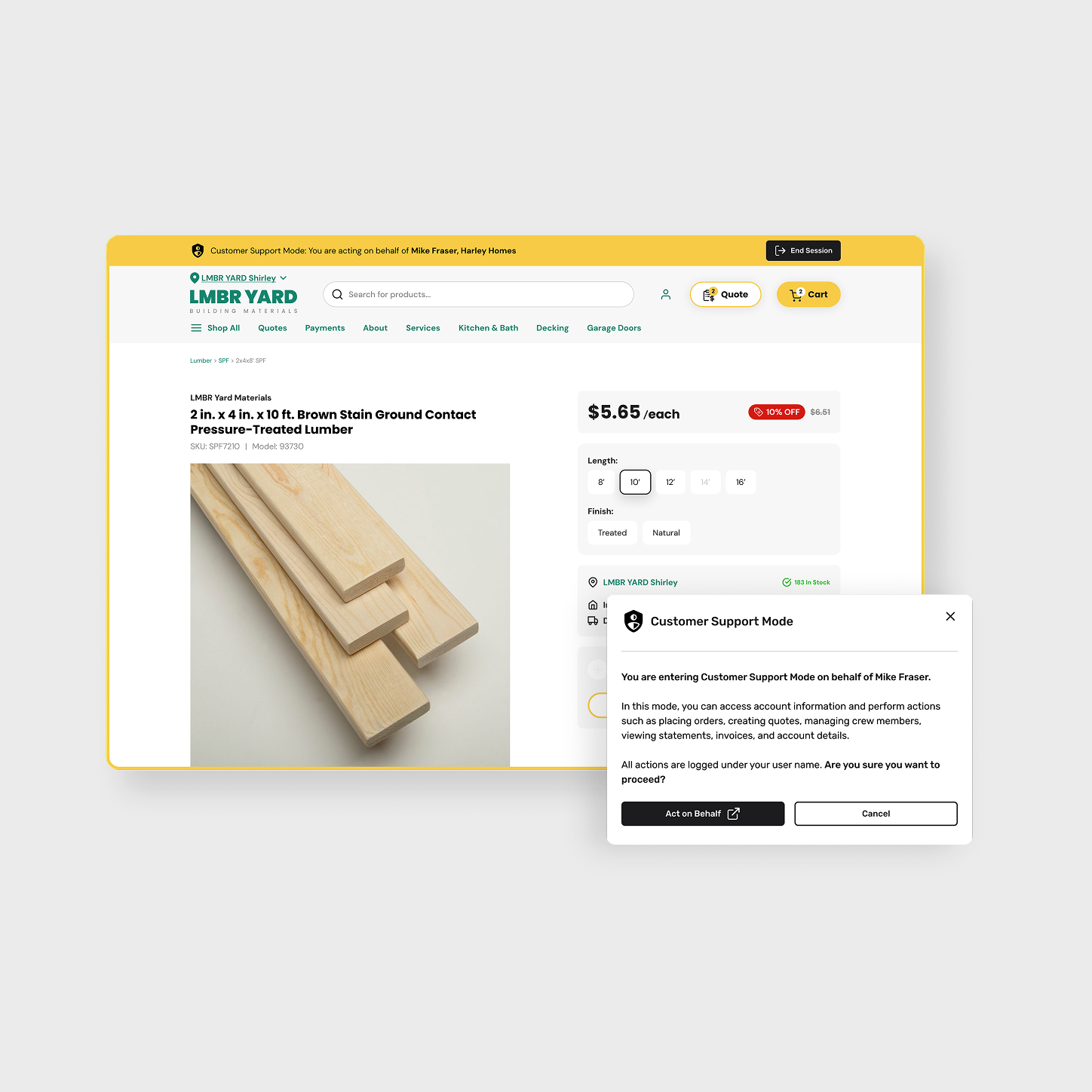
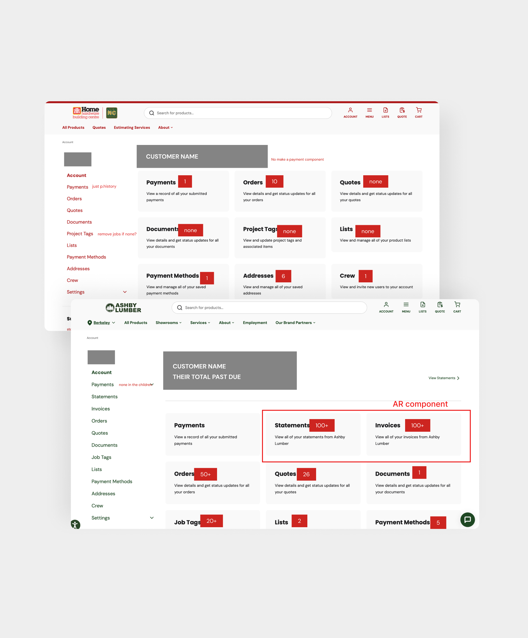
The other part of the research was using our "Customer Support Mode". I was able to log in into different accounts to gather information on the level of their activity, which lead me to understand that I had to be designing for different types of users.
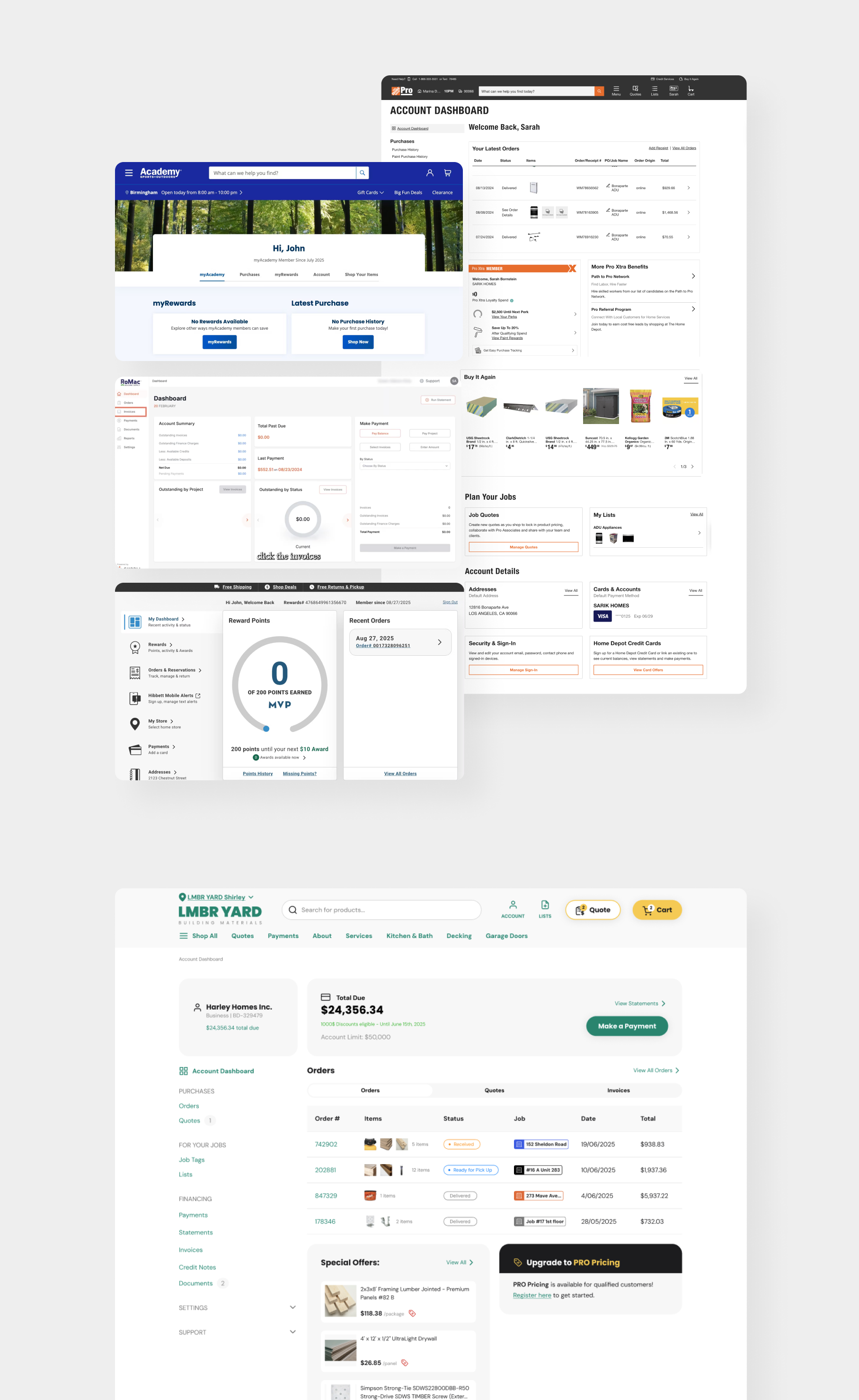
While taking Home Depot PRO and other dashboards as inspiration, the first designs were the attempt of highlighting everything at once on the page. The feedback was to simplify and make the view cleaner.
user personas.
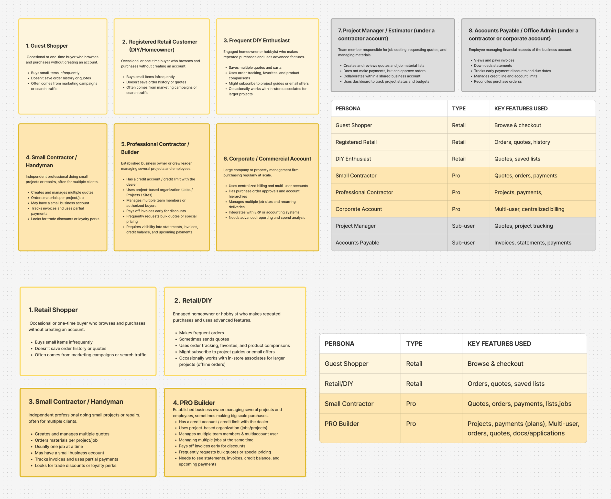
I decided to create user personas to clarify needs & priorities. I initially explored several user types, then narrowed the scope to 3 primary personas:
Retail Shopper – occasional purchases, order visibility
DIY User – repeat purchases, light account management
Contractor/Pro User (combined together) – frequent orders, account-level management, payments, multiple jobs, credit account
the solution.
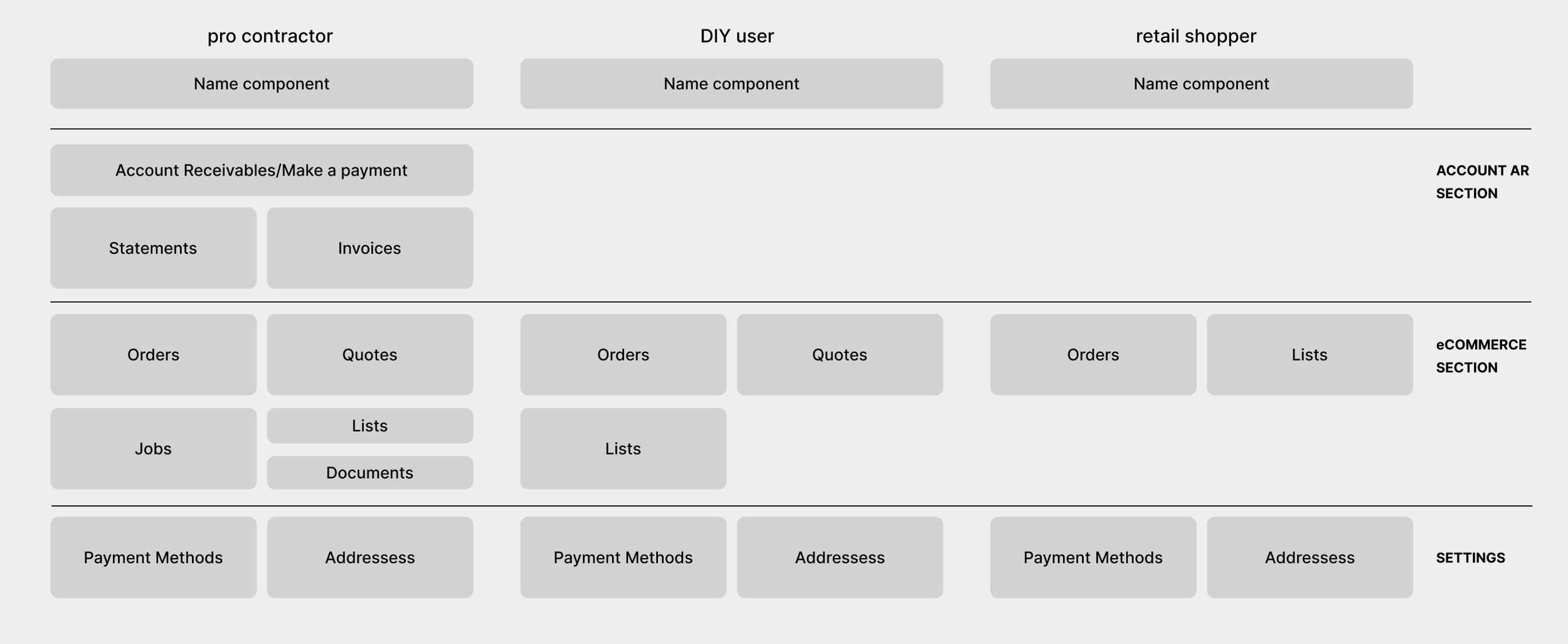
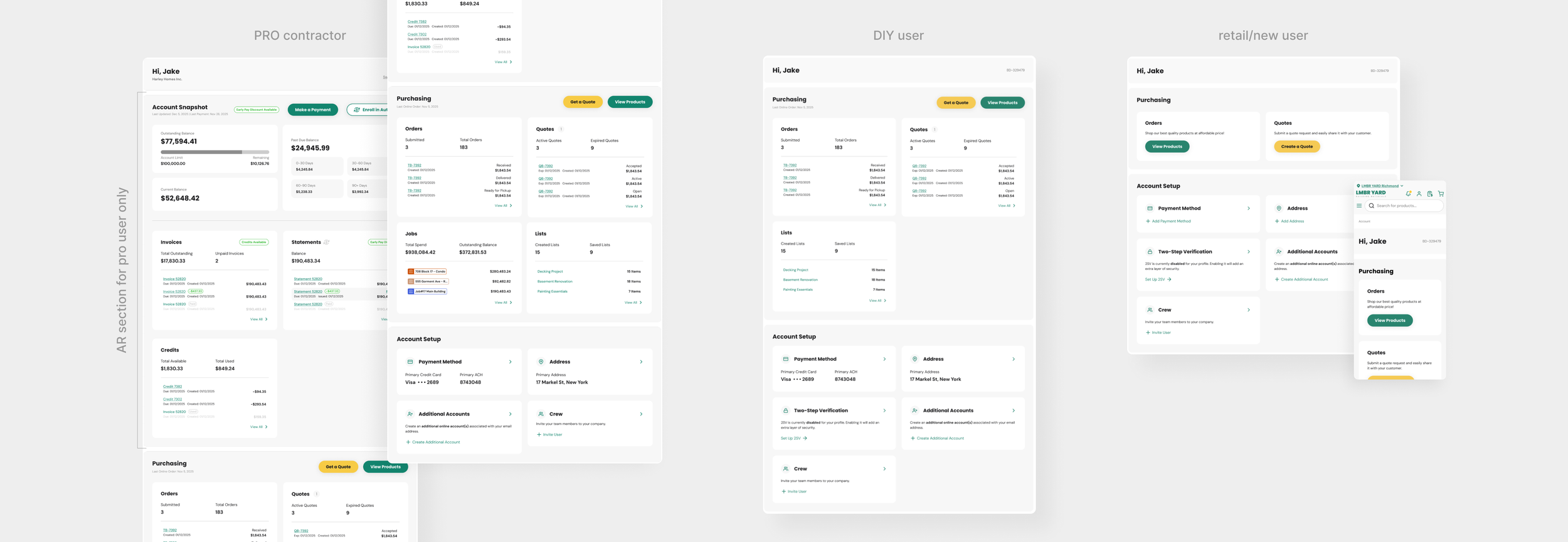
The goal was to have a component-driven dashboard where sections are toggled on or off based on conditional logic. For a Pro user, the dashboard prioritizes debt management, quotes, and job tracking, while a Retail user sees a simplified view focused on order status. I ensured that all components were reusable and could change states without breaking the layout. This modularity ensures that as we add new features, they can be plugged into the existing grid very easily.
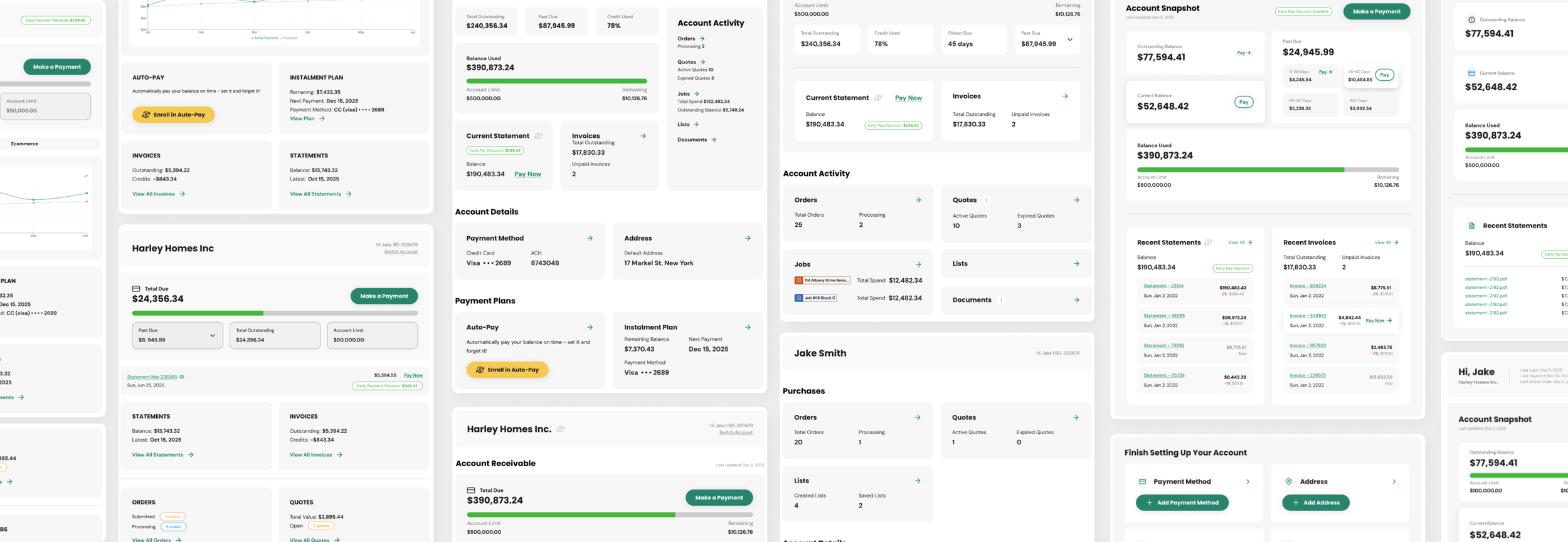
Below are iterations for the dashboard system.
the final designs.
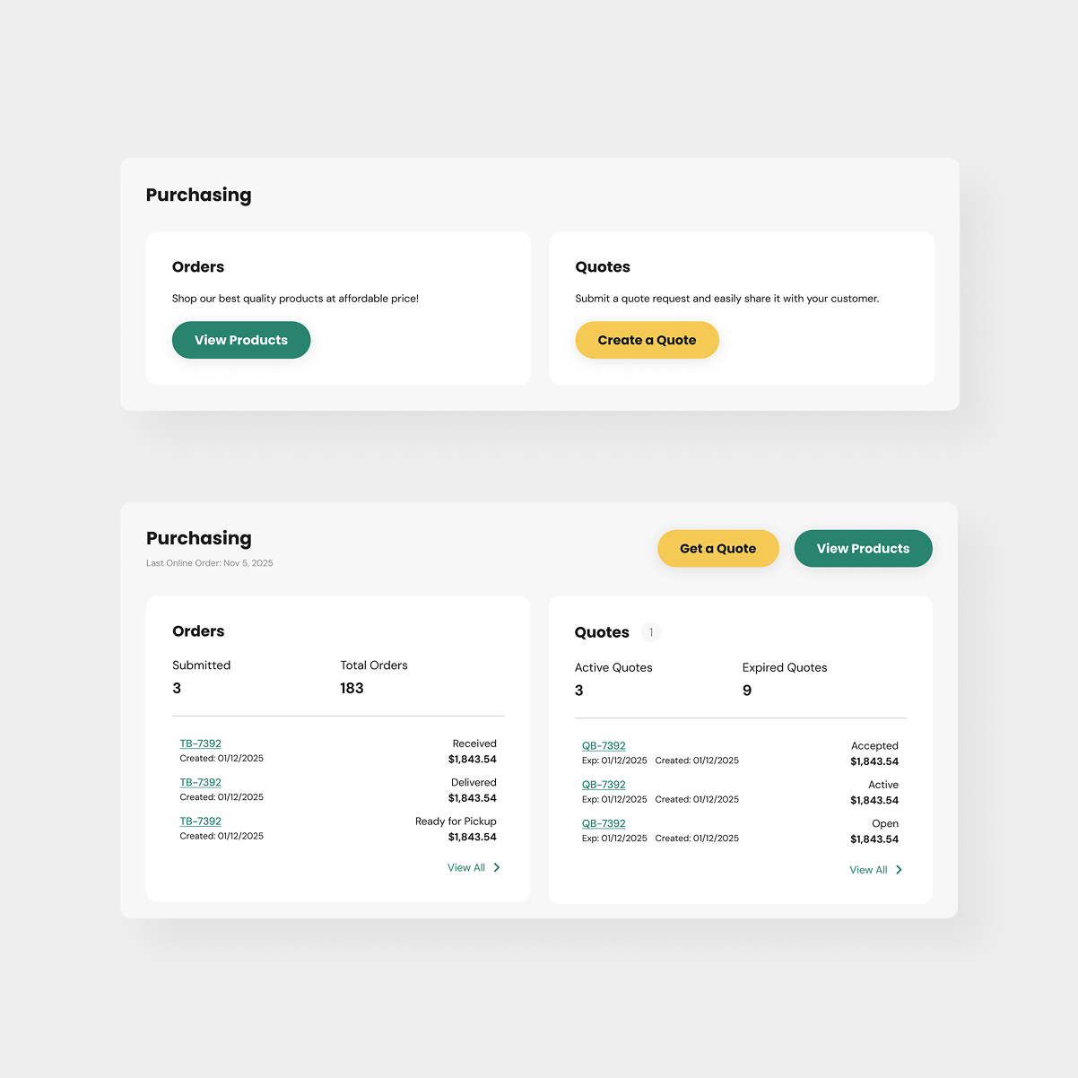
I designed the components to be dynamic based on the user's state. For example, if a user had no active quotes, the component would switch to an 'empty state' with a clear CTA to guide them into the feature. I also built in a lot of layout flexibility in other components, where some data would hide/show depending on sellers type of business.

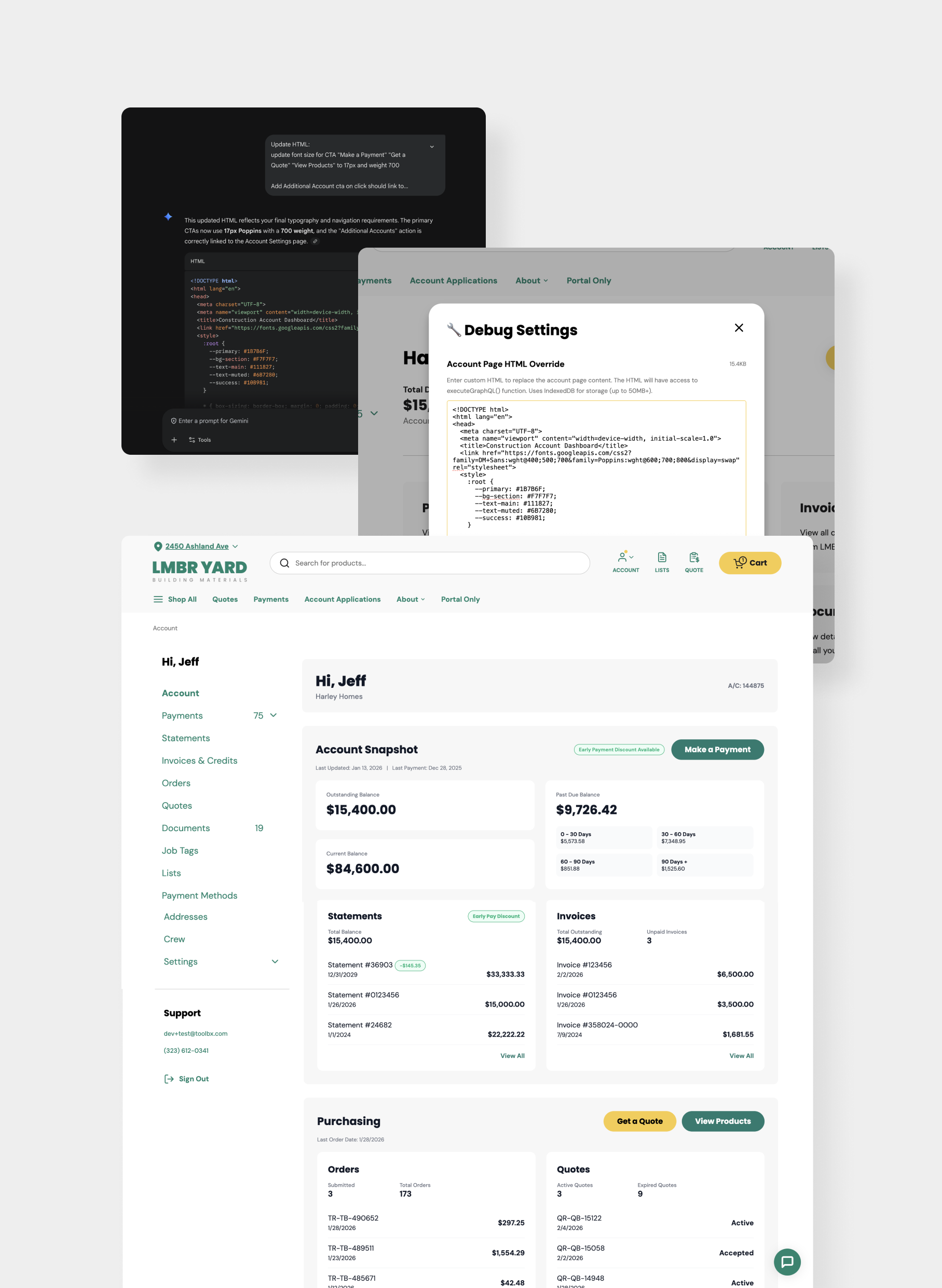
internal html adaptor + ai for demo.
I used an internal engineering tool to bridge the gap between static design and functional code using LLMs. While it was tempting to prompt for awesome features that didn't exist yet, I stayed focused on what we could actually deliver to our users today.
After a few prompt iterations combined with my Figma exports, I was able to preview the HTML on our platform that was able to pull real account data into the UI. This made our user testing sessions significantly more impactful, as sellers could interact with the data, providing a clear and valuable feedback.
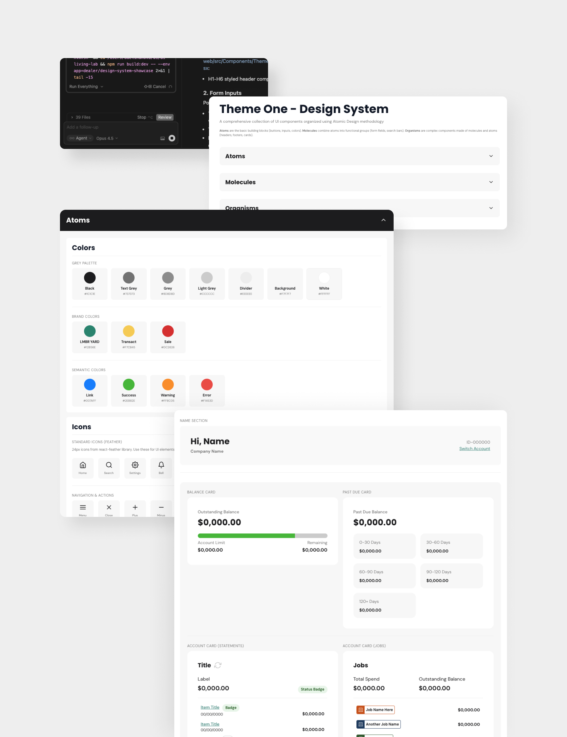
vibe coding with cursor.
My goal was to bridge the gap between design and code by adding our design system directly into the codebase. Using Cursor I also vibe coded the new dashboard components, so engineering could use production-ready elements immediately. This shift significantly reduced the usual back-and-forth and transformed our QA sessions into high-speed, collaborative meetings.
Taking full ownership of the component logic was a win for the whole team. It cleared up any confusion between design and code, which meant we didn't have to spend nearly as much time fixing bugs or inconsistencies.
the outcome.
Reduced Design Debt: We now maintain one flexible dashboard system instead of multiple separate designs.
Engineering Efficiency: Implementation was much faster with AI for myself & engineers.
Scalability: The framework is now being used by internal teams to experiment with new features without needing a full design overhaul.
The rollout will begin with a controlled seller A/B testing. Success will be measured by:
Higher transaction completion rates
Increase in seller revenue processed through our platform
Reduced time-to-action on key dashboard tasks