enabling milti-theme growth
Sole Product Designer | Research, Design System, UX & UI | 2024Expand our offering beyond our existing theme to better serve customers who prefer a more practical, enterprise-focused construction experience.
TL;DR
the problem.
The existing e-commerce theme was well loved, targeted toward a new fresh & friendly feel, consumer-style experience, limiting appeal for dealers who wanted a more professional, enterprise-grade storefront aligned with industry expectations.
the solution.
I introduced a flexible theming system that supports different styles without changing the codebase. It’s helping engineering move faster, and 40% of sellers are on Theme Two.
the outcome.
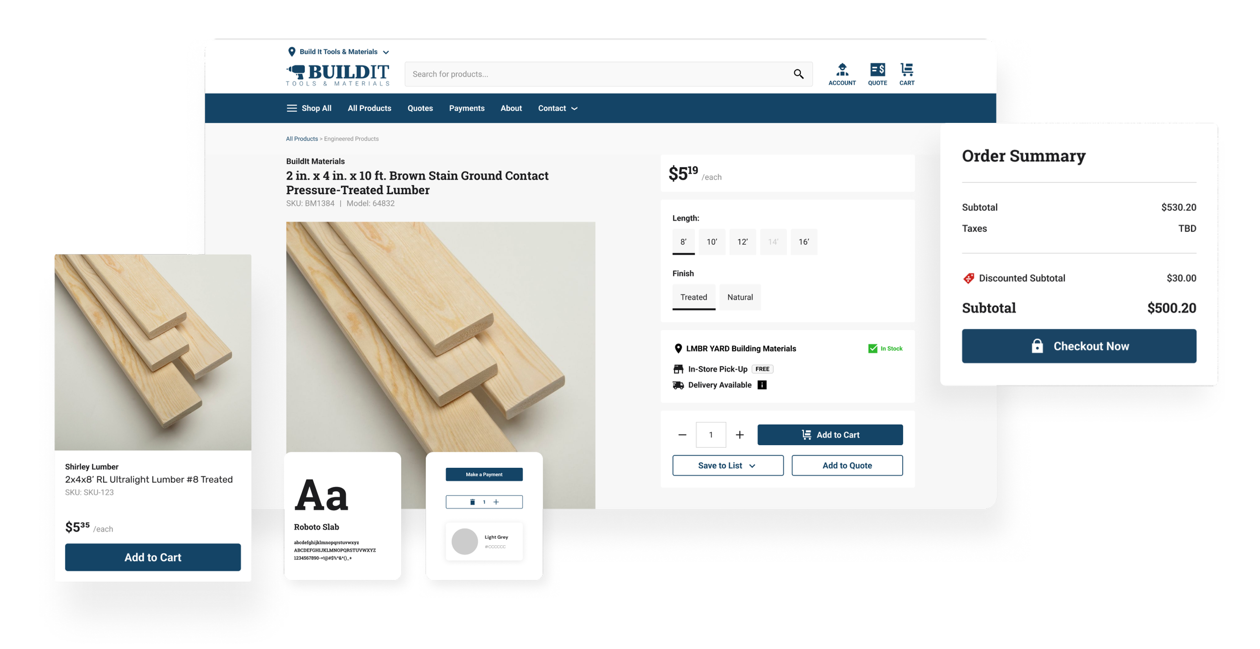
I designed a second, fully distinct theme with a more serious and utilitarian visual language, while intentionally aligning typography scales and component structure with the existing system to enable easy theme switching at low engineering cost.
scroll down for the detailed study ↓
the problem.
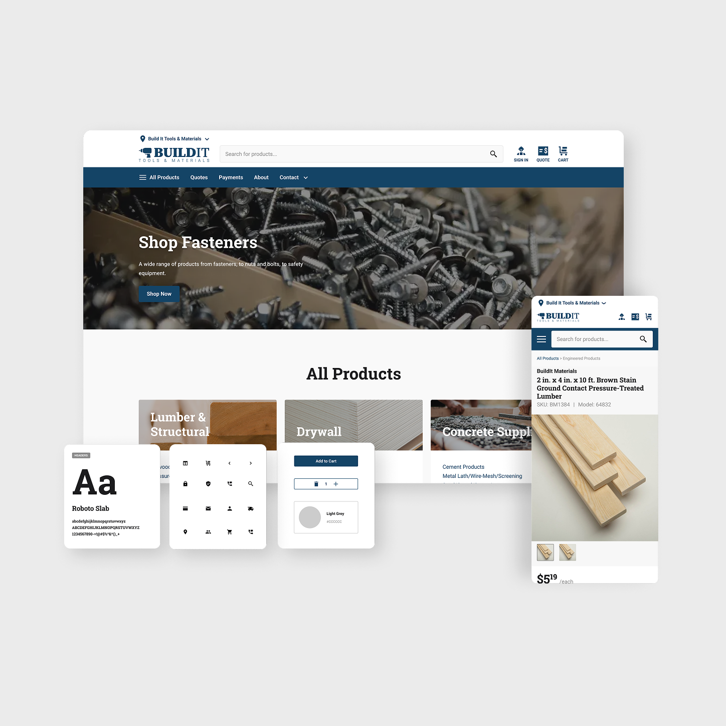
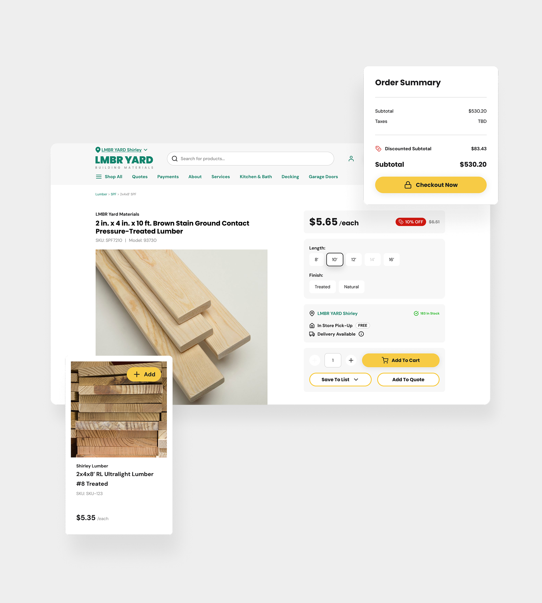
Our platform’s original theme was friendly, had rounded components and approachable typography, which worked well for many, but didn't resonate with more traditional construction sellers.
Many wanted a look that felt more utilitarian, dense, and "serious”. We even got feedbacks like “we want to look different than our competitor”. The challenge was to provide this visual variety without creating a completely different product. We needed a way to change the "vibe" without changing the underlying functionality or codebase.
the solution.
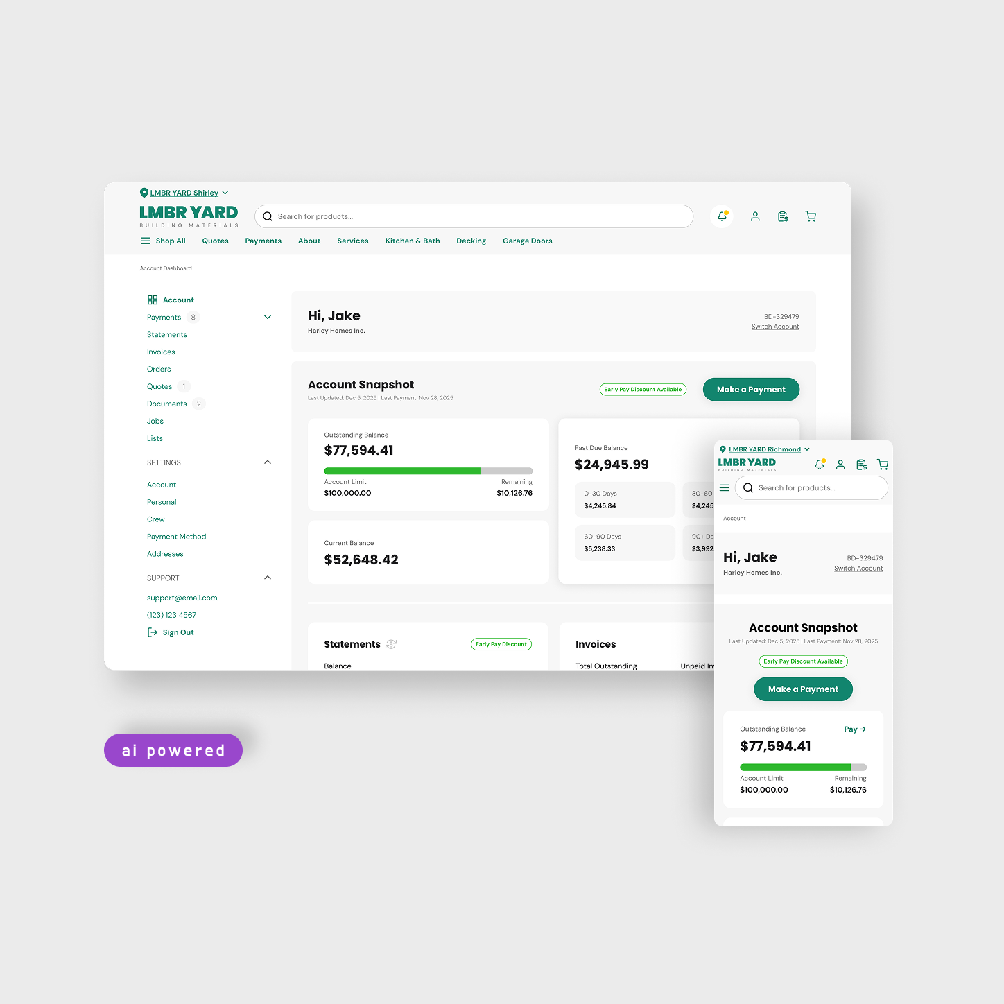
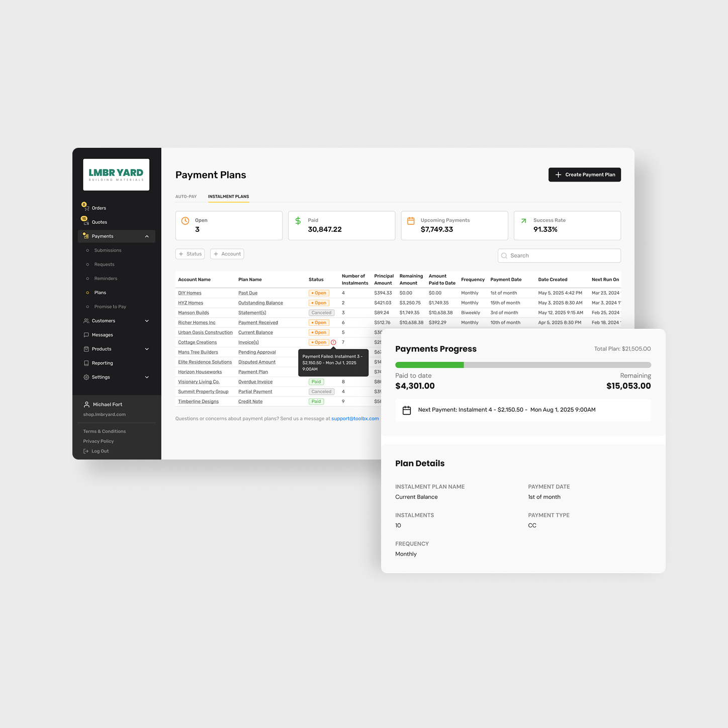
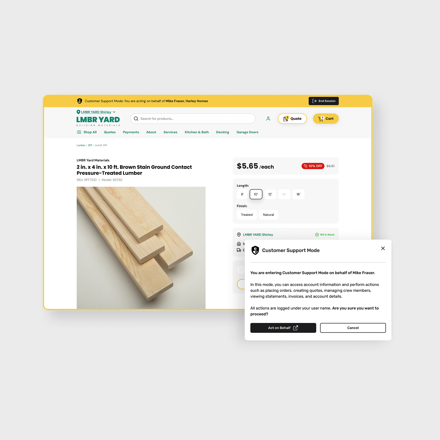
I designed "Theme Two," which utilizes square components, tighter spacing, and a more neutral typography. I removed decorative animations and excessive whitespace to allow more data to fit on the screen, which is a big requirement for professional contractors. This resulted in a professional look that appeals to industrial-scale sellers.
iterations.
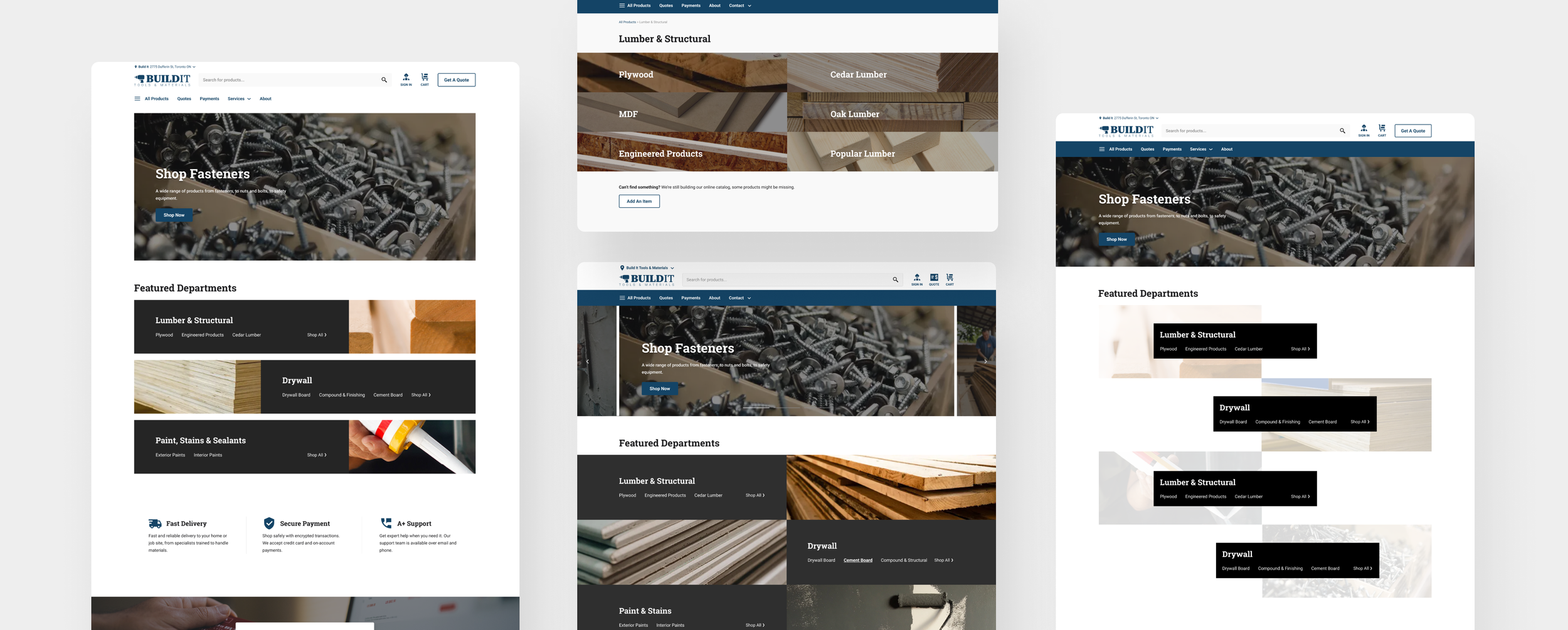
Early iterations leaned too far toward visual differentiation. I was trying to make the Theme Two very different by experimenting with unique layouts, which lead to unnecessary shift from the base system.
Through iteration and feedback, I learned that systems alignment is more valuable than novelty. The uniqueness comes from custom typography and the brand colors for each seller.
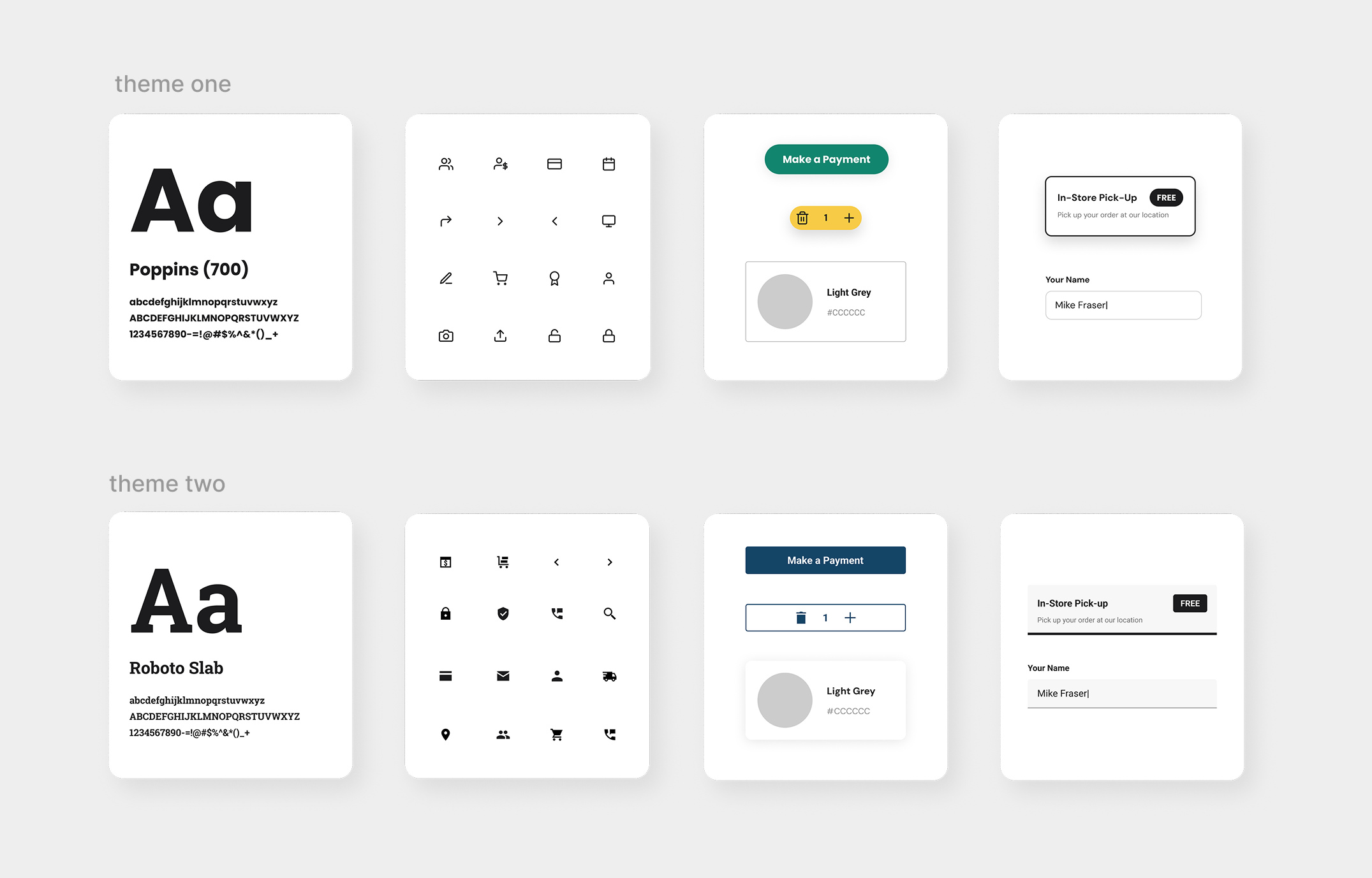
theme one & theme two
Theme One was already doing great, but adding Theme Two felt like the missing piece of the puzzle. They’re almost opposites: one is a rich retail experience and the other is a clean, pro-level vibes. Having both options makes the product feel way more complete and gives our sellers the power to choose the one that works for their business.
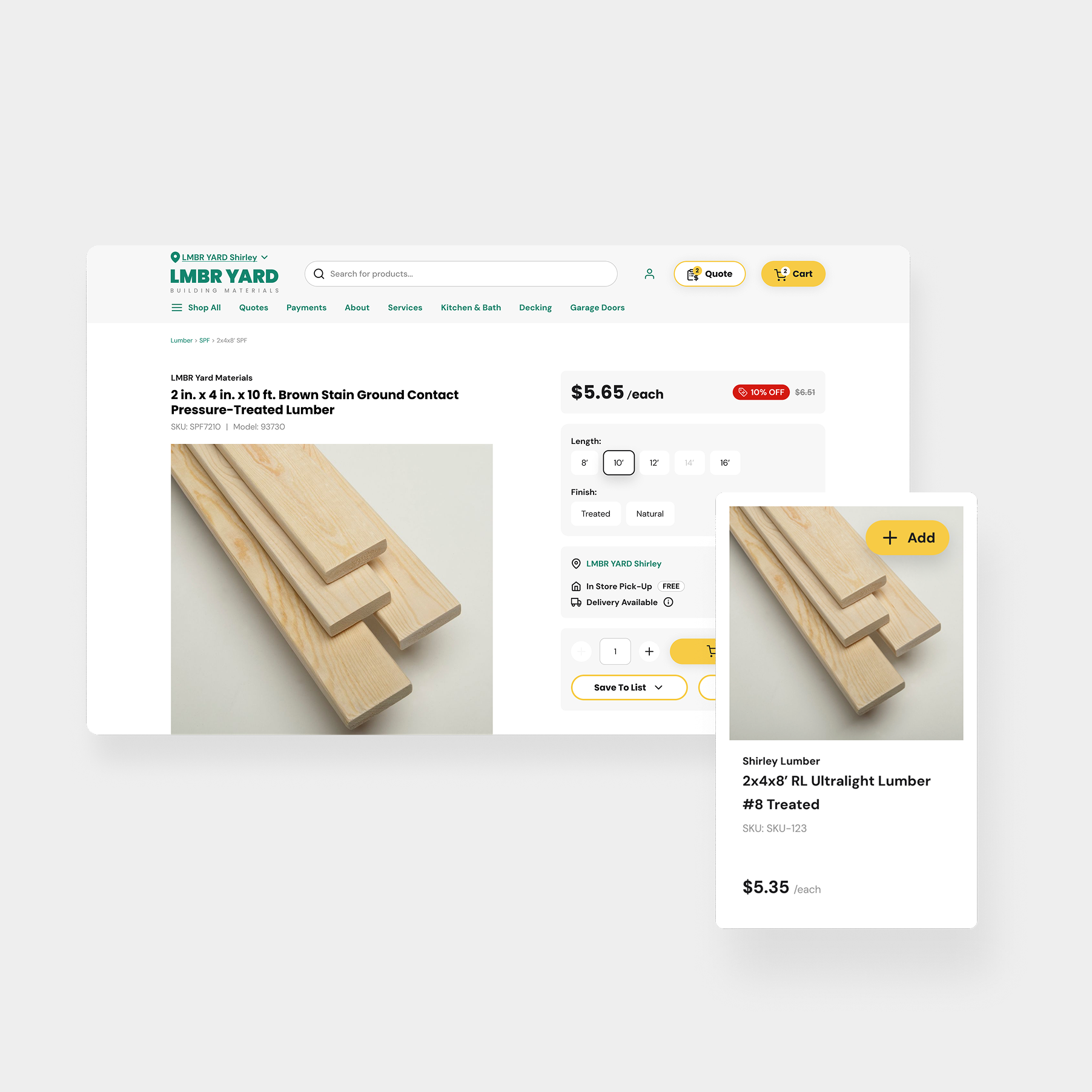
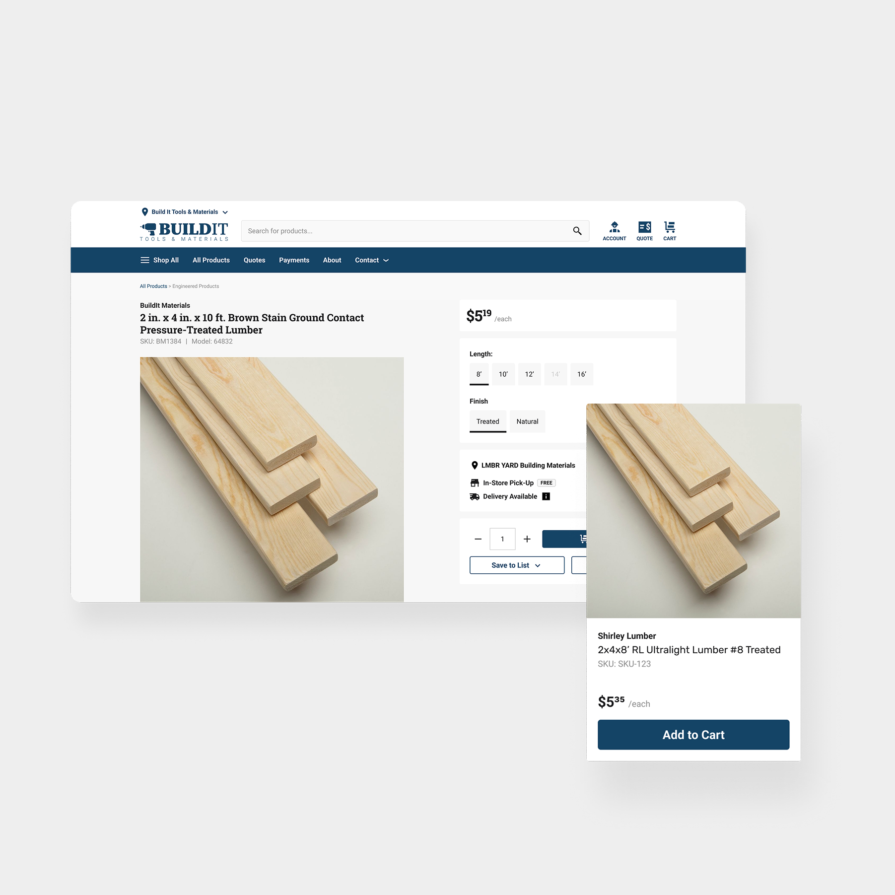
the outcome.
Market Versatility: The sales team can now pitch to a wider range of clients by offering two very different themes.
Easy Maintenance: Because the themes share the same functional logic, new features only need to be designed once to work on both.
Platform Growth: This project established the foundation for a multi-theme strategy that will support the company’s long-term scaling. 70% of sellers are currently on Theme Two.